Demo WebApp
Try Achromator with your own image
iOS App
This is the documentation page of iOS App "Achromator", which is available from the Apple App Store:

Translating Color to Monochrome
Achromator is designed to explore a simple idea: Can the vibrant world of color be meaningfully represented in monochrome? By translating color into grayscale through dynamic transparent textures, Achromator offers a unique way to interpret and interact with visual information.While there are many systems which try to make color accessible to people with impaired vision, Achromator is unique in that it translates important structural characteristics of color rather than just dealing with color names. Where other systems basically provide a dictionary, Achromator brings the grammar.
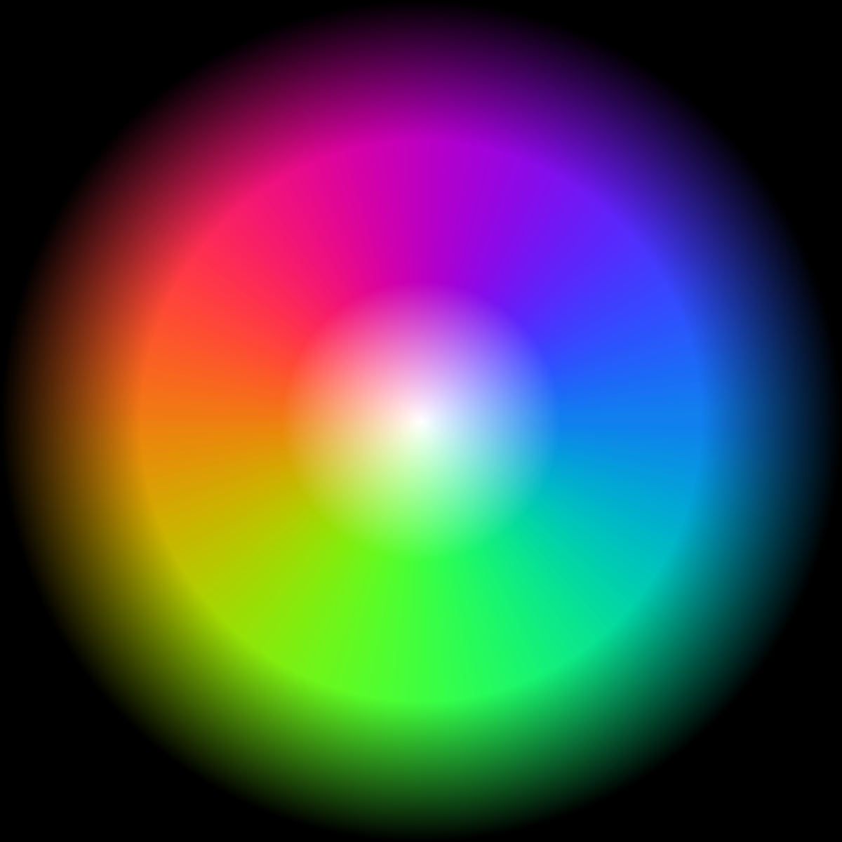
The approach may resonate with those curious about exploring how color and structure of color can be expressed in other forms. It captures key features like lightness, vibrancy, mixing of colors and complementary colors, creating a monochrome view that retains much of the richness of the original setting.
What Does Achromator Do?
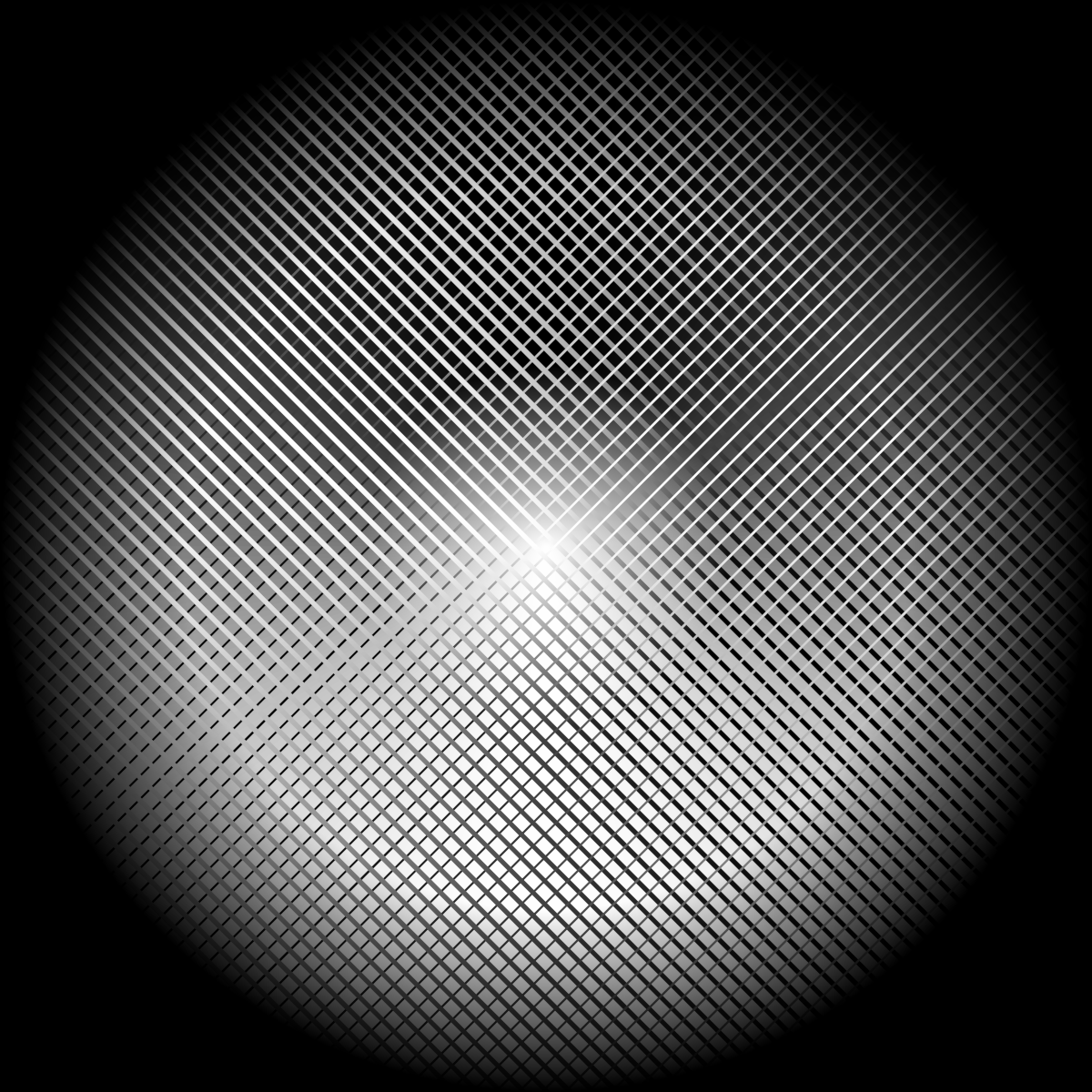
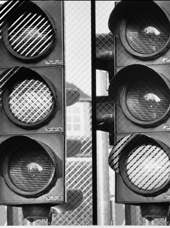
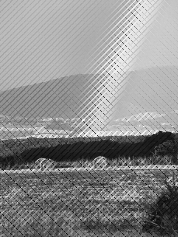
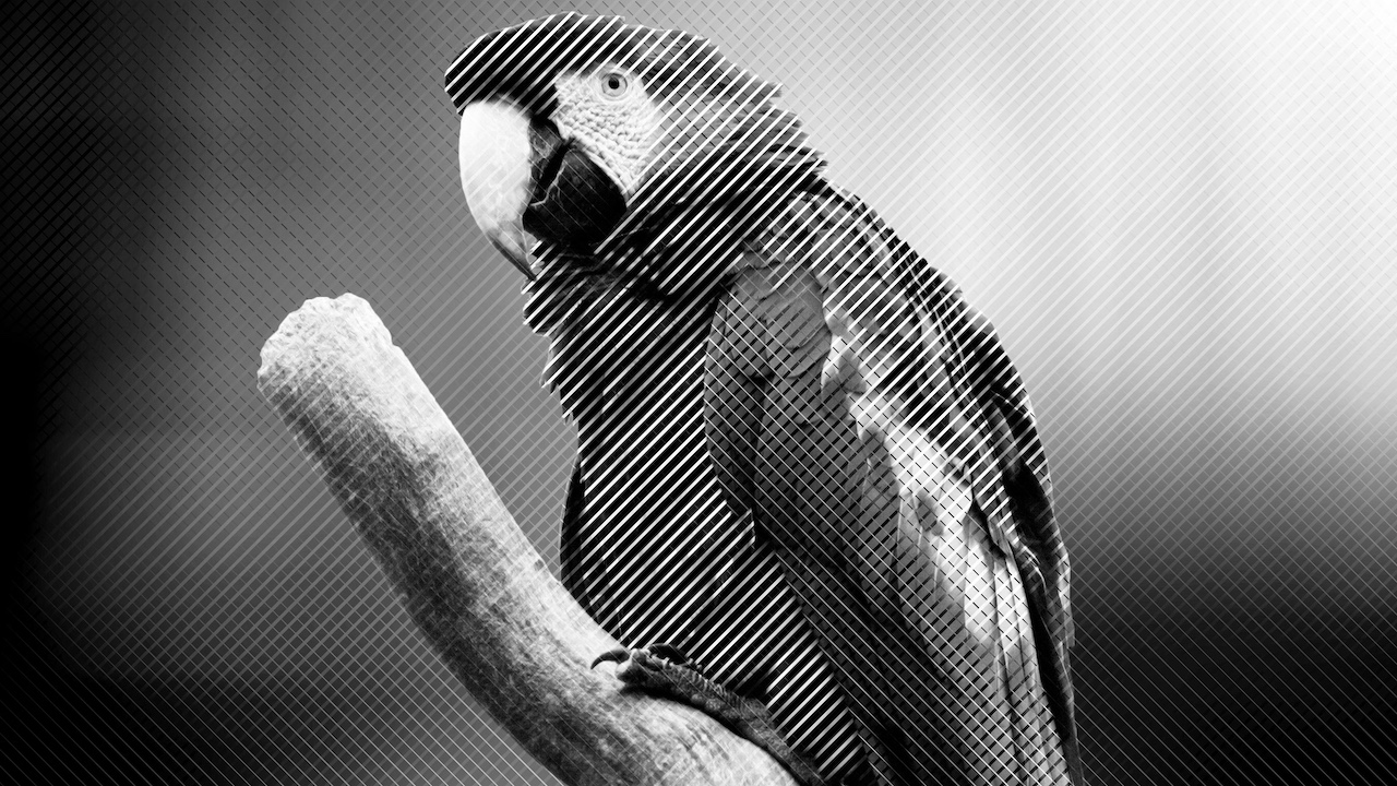
The iOS app reads the video feed from a phone camera and turns it into a black-and-white view. The monochrome result is not arbitrary — its dynamic textures represent the original colors. You see a grayscale version of the scene, but with additional texture that carries almost all color information present in the original.
Achromator is designed to translate color in such a way that key features and structure are captured in monochrome. Here is the result:
- Average Local Lightness: The translation preserves the average lightness of each area of the image (with respect to a standard observer). In other words, for people with normal color vision, the lightness of a sufficienlty large part of the scene will be similar to the original, just in grayscale.
- Local Contrast and Chroma: The notion of chroma refers to how intense, rich or vibrant a color is. High chroma, like for a saturated red or a pure yellow, is translated into high local contrast in the monochrome feed. In the grayscale video, areas with higher contrast correspond to more vivid, saturated colors in the original.
- Achromatic Colors: An achromatic color is a color like white, gray and black which does not have any chroma. These are often not even considered proper colors. Achromator translates these colors without change, so there will be no additional texture on any area which is achromatic in the original.
- Complementary Colors result in Complementary Textures: Colors which cancel each other out when added (typically those are drawn on opposite sides of the color wheel) like red and green, or blue and orange, are called complementary. In this sense, there are complementary textures in the grayscale feed. One could add the monochrome texturing and they would cancel each other out. This creates a visual relationship that mirrors how complementary colors behave in the world of color theory, but now in the form of textures.
- Smooth Blending: Just like colors can smoothly transition, the app creates textures which can blend smoothly too. When the original colors change across a gradient, the textures smoothly move from one pattern to another.
Who is this for?
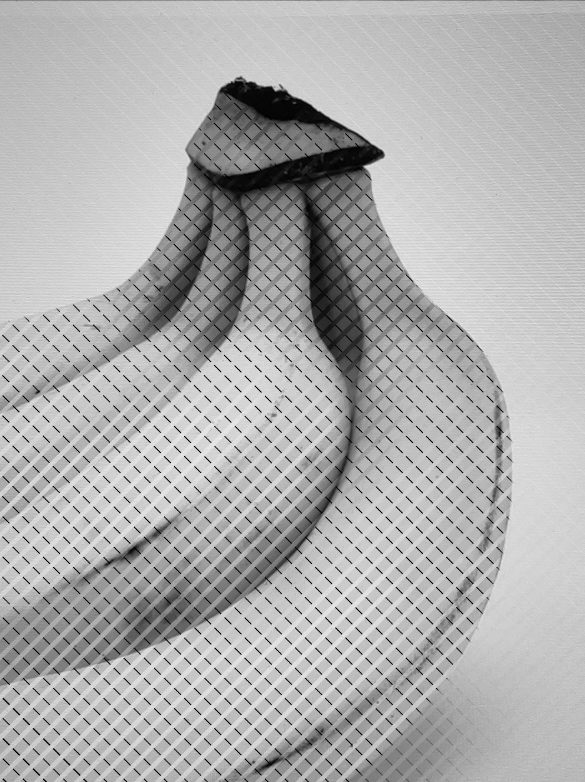
If you are visually impaired in a way that your visual system does not have the ability to distinguish color, this might be helpful in understanding color and its structure. It might also help in day-to-day activities like determining if a banana is ripe - but there may be easier or faster ways of doing this. We have had some level of input from colorblind people, but your feedback would be more than welcome!If you are a philosopher interested in perception and find color to be a puzzling concept, this may nudge you to look a little deeper into structuralist ideas?
If you are a mathematician, you might be delighted to see a very visual example of an isomorphism.
If you are a psychologist interested in sensory substitution, I am sure there are some interesting experiments to design. A successful pairing of this with the McCullough illusion would be awesome, so please let me know if anyone attempts that!
Using the App
Basic UI Controls
The app always shows the live camera feed from the back camera. It offers the following controls to adjust the visual output:
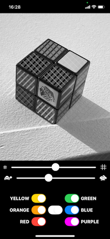
- Video View: This view shows the live video from the back camera with continuous autofocus and brightness adjustment. Pinch to zoom. Tap with one finger to trigger White Balance (see section below).
- Pattern Size Slider (top): This slider control the grid size of the monochrome patterns applied to the live video. Users can adjust the size to balance pattern resolution against their visual ability. A finer pattern provides more information, but a coarser pattern might be more discernible. The minimum setting deactivates all patterns and results in a simple monochrome view.
- Pattern Speed Slider (second from top): This slider controls the speed at which the monochrome patterns move. In combination with the individual toggles below, this can be useful to increase visibility of selected areas. For a detailed look at one surface, one may want to stop the animation temporarily by setting the speed to minimun or zero.
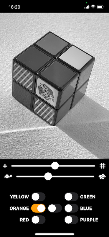
- Individual Color Toggles (six outer buttons at the bottom): These special toggles (RED, ORANGE, YELLOW, GREEN, BLUE, PURPLE) are included based on feedback from a person with Achromatopsia. They restrict pattern generation to areas of a predefined color range, which makes it easier to learn the app, and provides additional usecases. The app applies its unique moving patterns only to those areas of the video which contain a color from the selected range. Note that the six color toggles are designed cover the entire color space, and each possible color in the image is included in exactly one of them. This means that any toggle includes multiple different shades of color, and e.g. "RED" will not just have clean, deep red, but also include shades of brown and pink. The selection of color ranges is based on common english color names, not on any particular symmetry or logic.
- White Toggle (center button at the bottom): This toggle activates or deactivates all individual color toggles simultaneously. When all color toggles are on, the app considers every pixel of the live feed for translation into a pattern, but achromatic colors (white, gray, black) will always be translated into a flat pattern, which does not contain motion. Activating all color toggles can therefore be used to identify areas that are colorless, as these are the areas which do not move even if all color toggles and motion are activated.
An Important Detail: White Balance
Lighting conditions influence how colors appear to the camera, which affects both how a color will be classified and the monochrome translation. It is therefore important to adjust the camera to the situation, especially when there is artificial lighting or a clear blue sky. The app does not automatically change white-balance settings, since such behavior can also get in the way. Instead, it expects the user to explicitly trigger a white balance calculation by tapping into the video view. This adjusts the camera, assuming that the average color of the current scene is gray. The camera will adjust only within a certain range of typical illuminations, so if you don't see any effect, that might be due to a very colorful scene or tinted lighting.
The most reliable way to do white balance is to point the camera at a large white surface when tapping. One can always check the success of white balancing by verifying that a known white surface indeed does not show up as patterned.
Possible Applications
For People with Monochromatic Sight
The rare condition "Achromatopsia" not only includes monochromatic sight, but also a lowered visual acuity, which can make the fine patterns within this app challenging to use. The predefined color toggles and motion elements have been introduced to address this, and we believe that the Achromator can be helpful for activities like- reading subway maps
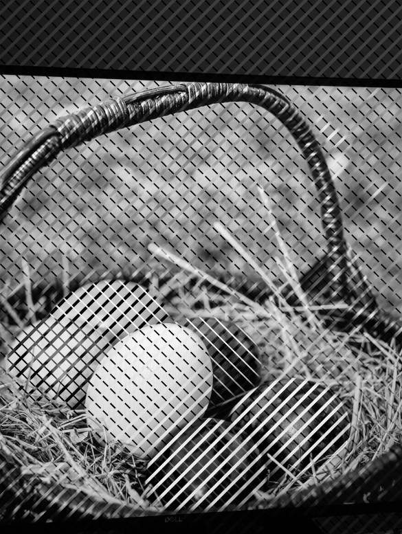
- judge the ripeness of a banana
- finding a car in the parking
- easier shopping for color-coded items
- nartwork like painting and drawing
- to experiment with color mixing
- ... and many more ...
For People with Deuteranopic, Protanopic or Tritanopic Sight
The app is not tuned for people with partial color vision, but it can be an easy-to-use helper in everyday situations, e.g. when once again, presentations or project reporting is done in red, yellow and green. (feedback welcome -- get in touch)For Printing and Visualization
The logic underlying the video filters in this app can be used to translate color graphics for b/w printers, (feedback welcome -- get in touch if you are developing printing solutions)Anything Else?
If you have any questions, feedback or need assistance with the app, send an email to support@xpolar.org